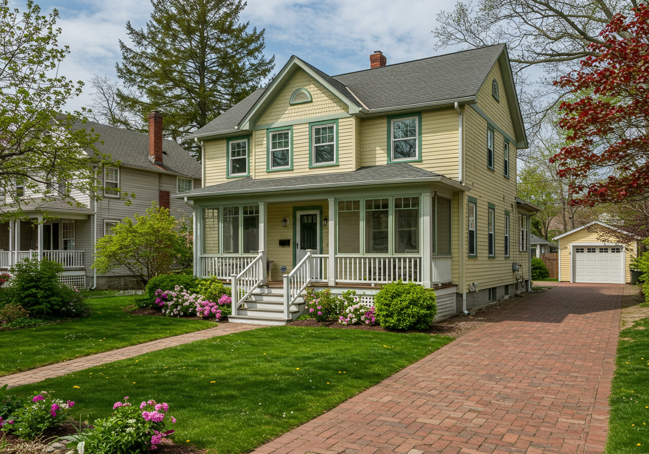
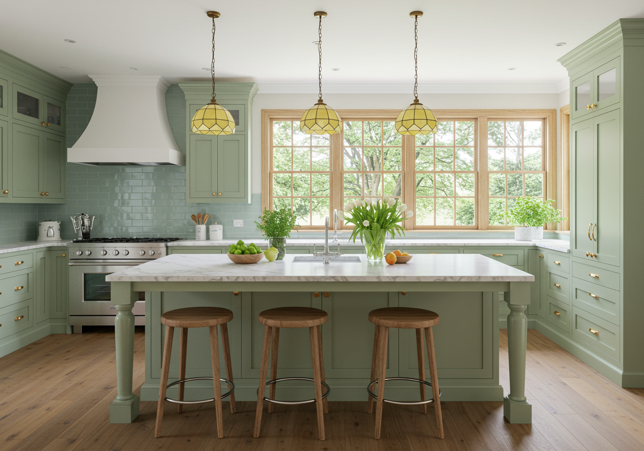
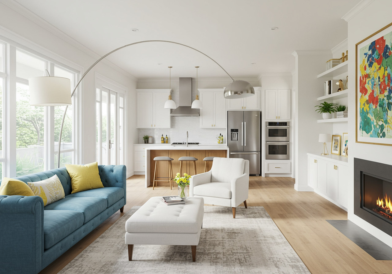
Better with age. Photograph by Jenn Verrier Photography.
The One From the 1890s
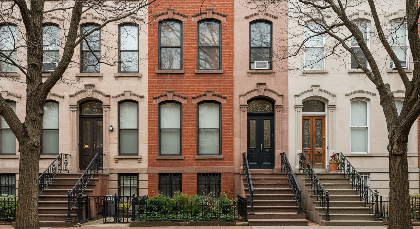
If a Victorian-era visitor called at this 1896 Capitol Hill rowhouse, she’d find the etched-glass vestibule doors and marbleized wall panels familiar. But the Nelson lantern lights, contemporary art, and Eames wall hooks that share the entryway? Not so much. Designer Nicole Lanteri wasn’t hired to preserve the place in amber, after all. Rather, the family who tapped her to remodel the three-story home in 2017 asked that she both save some of its characters and inject it with youthful energy. “They hired me to make it feel fresh,” says Lanteri.
The one from the 1890s. Photograph by Jenn Verrier Photography.
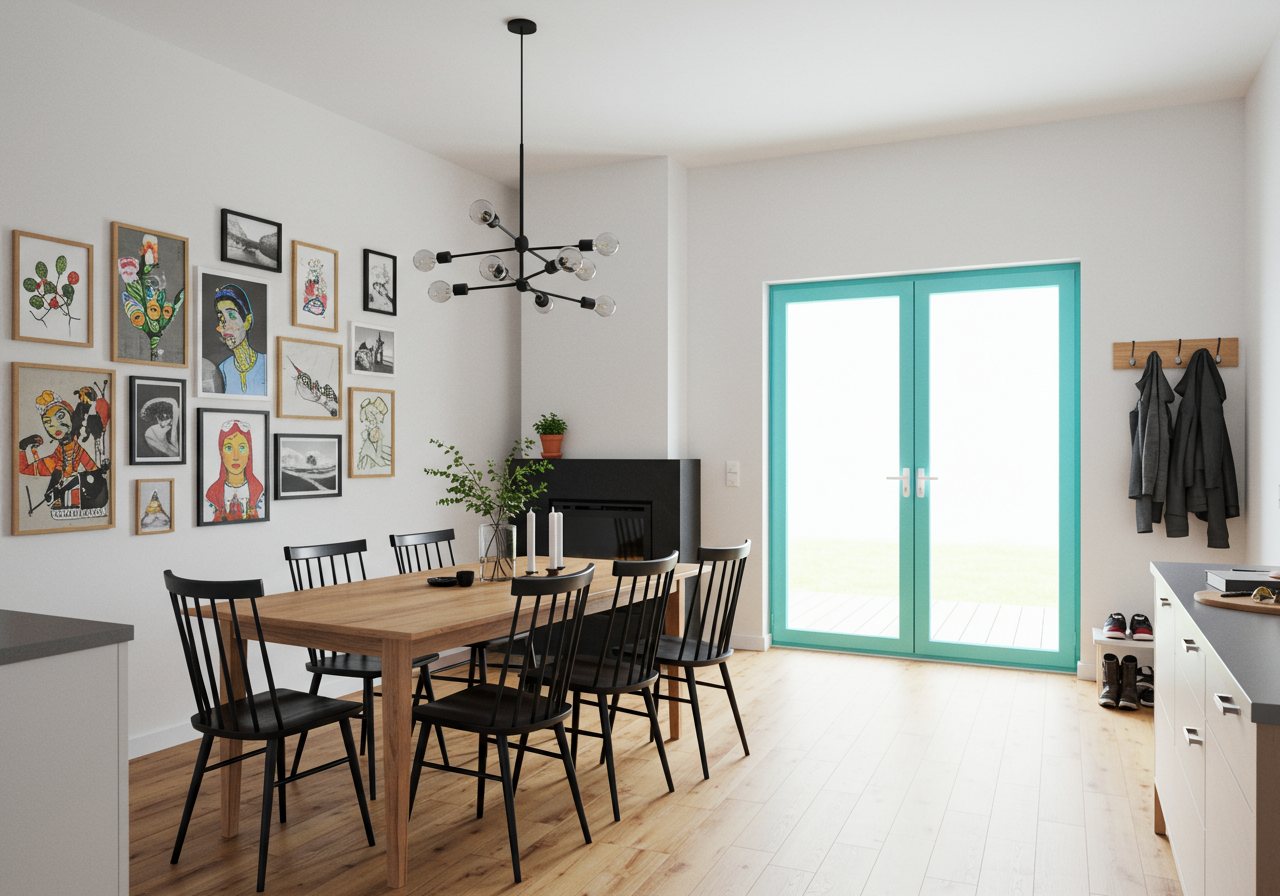
A lot of the revamp was powered by paint. Bright white replaced a creamier shade on most walls, summoning a gallery-like mood. The dining room, previously unappetizing mustard, got a few coats of Benjamin Moore's “Gentleman’s Gray.” In the eat-in kitchen, a glossy, Tiffany-ish blue jazzed up the old trim. Luckily, many of the main level’s most charming features—ceiling medallions, honey-colored wood floors, the living room’s intricately carved fireplace mantel—were still intact. “We could have painted [the mantel] white to make the room look larger,” says Lanteri, “but it’s beautiful and unusual, so we kept it as is.”
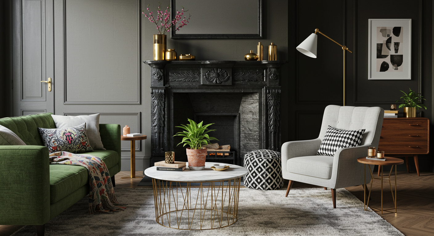
Designer Nicole Lanteri chose clean-lined living-room furniture that doesn’t compete with the intricate 19th-century mantle. Photograph by Jenn Verrier Photography.
To build contrast with those original details, Lanteri chose furniture that leaned midcentury modern—such as Crate & Barrel chairs in stark black, clustered around the kitchen table, and an Industry West marble-topped coffee table in the living room. A few antiques—including carved 19th-century dining chairs—create an eclectic, comfortable mix.
Painting the original trim work in the kitchen, a shade of bright aqua helps it stand out and look fresh. Photograph by Jenn Verrier Photography.
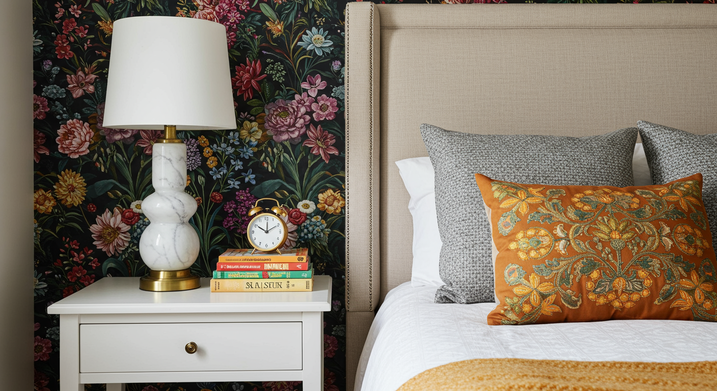
On the upper levels, there’s a similar compromise between old and new. In the second-floor family room, another ornate mantel was painted matte black to match new built-in bookcases. “It makes everything look like it belongs together,” says Lanteri. Tailored pieces—a squared-off leather sofa, a West Elm chair in a black-and-white print—add up to a cozy, multipurpose space. In the adjacent master suite, a wall of punchy floral wallpaper riffs on the botanical prints Victorians adored. “But it’s a midcentury Swedish pattern,” says Lanteri. “So there’s something interesting and new going on.”
The One From the 1910s
The one from the 1910s. Photograph by Jenn Verrier Photography.
Some people who buy old houses yank out the radiators. Others hide them beneath covers. Designer Annie Elliott opted to accentuate the ones in her 1910 Wardman rowhouse by painting them in shades of bronze and brass. “Radiators are attractive!” she says. “My philosophy is if you have an old house with original features, why would you rip everything out?”
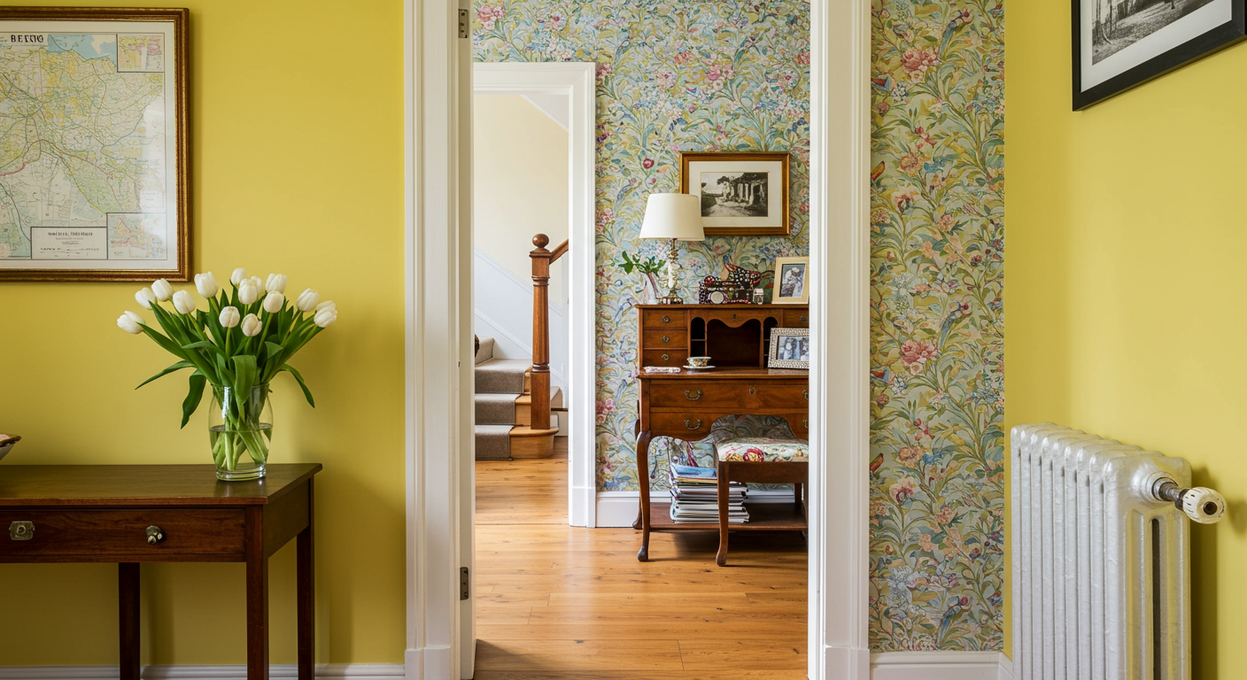
Sunny yellow paint and Nina Campbell’s “Paradiso” wallpaper enliven the foyer. Photograph by Michael Wilkinson.
Elliott moved into her Woodley Park home in 2005 with her husband and now-tween daughters. She has remodeled it in phases over the years, finding ways to preserve its historic integrity without making it feel antiquated. The original oak floors, coffered dining-room ceiling, and crown molding set off updated wallpaper choices: Nina Campbell’s bird-festooned “Paradiso” in the foyer, a safari-Esque tan grasscloth in the dining room. Many of the light fixtures are either new or relatively contemporary, including a dramatic Brutalist chandelier in the dining room. “There’s no faster way to update a space than with lights,” says Elliott.
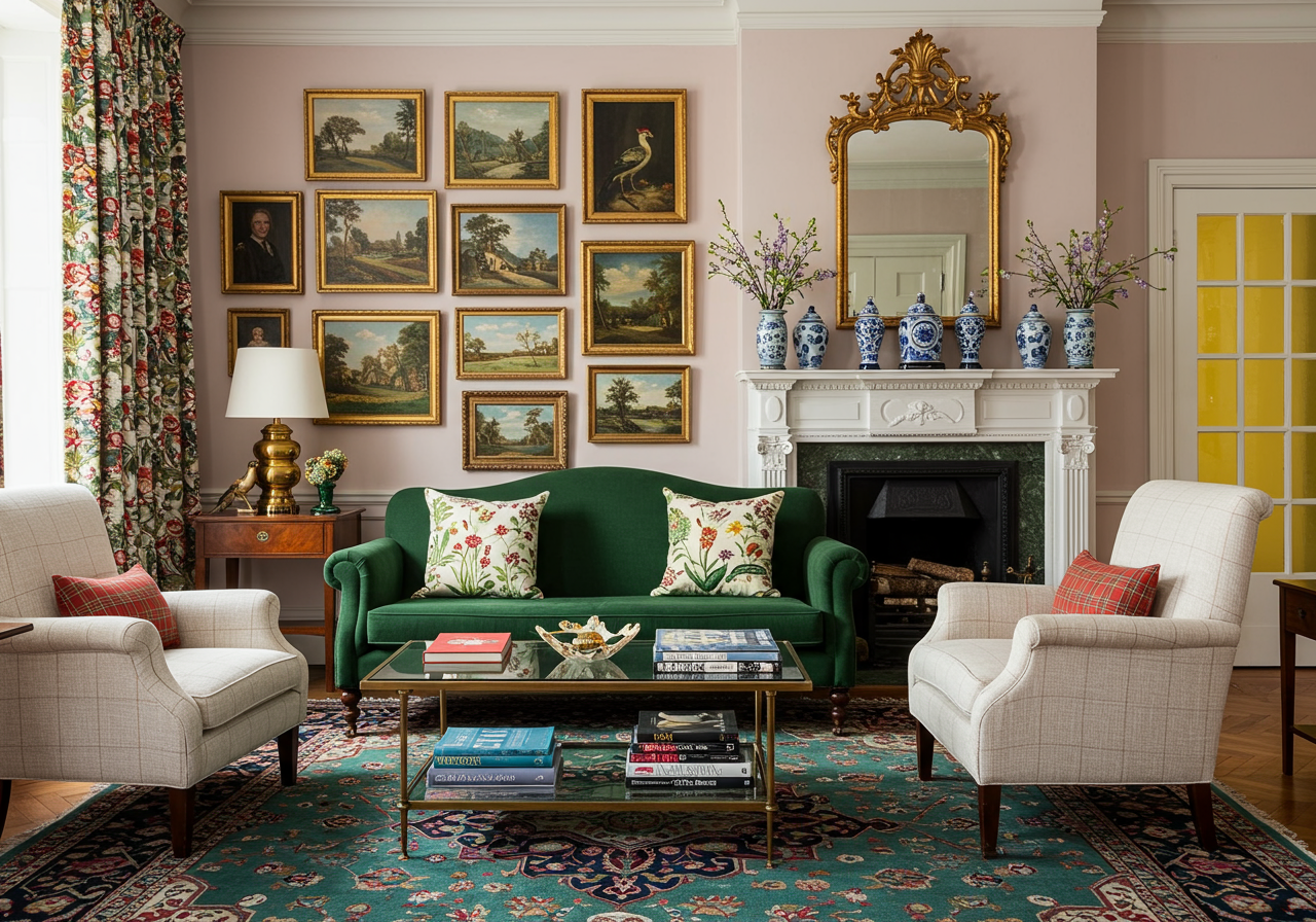
The paint in the living room is Benjamin Moore’s “Pink Moiré.” Photograph by Angie Seckinger.
In the plush first-floor living room, a skinny-legged antique sideboard plays nicely with modern sofas and chairs from Mitchell Gold & Bob Williams and CR Laine. An Oriental rug and a gallery wall of local and vintage art add to the mix. That soft-pink paint—Benjamin Moore “Pink Moiré”—serving as the backdrop? “It must be the seventh color I’ve had in here,” says Elliott. “I guess my house is my laboratory.”
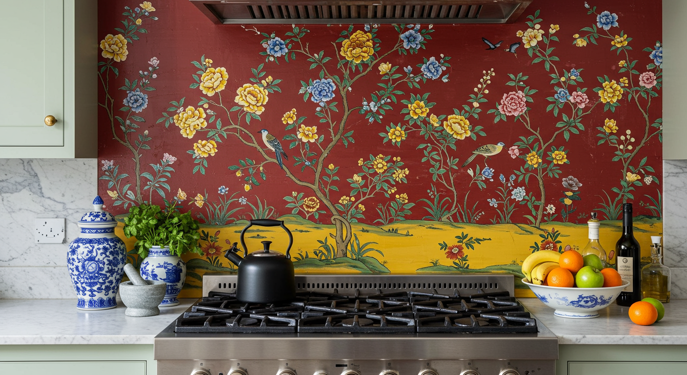
Homeowner and designer Annie Eliott commissioned a backsplash depicting Mid-Atlantic birds and flowers. Photograph by Jenn Verrier Photography.
Even the most dedicated old-house fans, though, often covet kitchens with all the modern conveniences, and Elliott is no different. Besides, whatever had been in her kitchen in the early 20th century was long gone by the time she moved in, replaced with 1980s-era, salmon-hued Formica and dated oak cabinetry. Her remodeled version stars gray-and-white Belgia marble countertops and a custom glass backsplash depicting Mid-Atlantic birds and flowers. The adjacent butler’s pantry only looks old-fashioned—it’s brand-new, though it does contain her grandmother’s vintage etched-glass goblets.
The one from the 1910s. Photograph by Jenn Verrier Photography.
The One From the 1920s
Retirees Christina and John Markey’s 1927 bungalow in Del Ray came from a Sears catalog. But when the couple decided to expand their kit house, they wanted to avoid a cookie-cutter remodeling job. “We love Frank Lloyd Wright and Craftsman style, so the most important thing for us was to maintain the home’s integrity,” says Christina. “But the house only had one bathroom upstairs, and the kitchen was dark and old. We wanted to make it more functional.”
Out of the Box: Winn Design & Build expanded the Sears kit house with a modern kitchen whose details and color scheme recalls the bungalow’s 1920s Craftsman roots. Photograph by Stacy Zarin Goldberg.
After interviewing several architects, the Markey's hired Michael Winn of Winn Design & Build, whose team increased the size of the house from 1,422 to 2,223 square feet. A two-level addition brought a new kitchen, half bathroom, and great room to the first floor as well as two bedrooms and a second bath upstairs.
Thanks to thoughtful details inside and out, it’s hard to tell where the old house starts and the new parts begin. When designing the addition, Winn mimicked the pitch of the original roof. Indoors, the new structure was adorned with oak moldings and floors to match those that came from Sears decades earlier.
Photograph by Stacy Zarin Goldberg.
Other changes pay tribute to the early-20th-century style. The spacious kitchen, for instance, got handsome wood cabinets in a period-appropriate grayish-green—Winn interior designer Jennifer Hall mixed many custom paint blends before she achieved that perfect Craftsman shade. The six-burner Thermador stove is the star modern feature. “It replaced the 1927 Vulcan range that I had to light with a match,” says Christina. “I love that the house still feels like an old bungalow, but it lives more comfortably now.”
The One From the 1950s
In a region full of rowhouses and brick Colonials, Bethesda’s Tulip Hill neighborhood of midcentury-modern ranches is a groovy outlier. “They’ve got long, lean lines, like a 1950s Chevy,” says homeowner Erich Cabe. The real-estate agent and his wife, Amanda, an accountant, bought a 1957 home in the area that needed work. They hired architects from Anthony Wilder Design/Build to reimagine the place. “Originally, we just thought we’d redo the kitchen, add a bathroom, and redo the master bedroom,” says Erich. “But that evolved.”
Photograph by Stacy Zarin Goldberg.
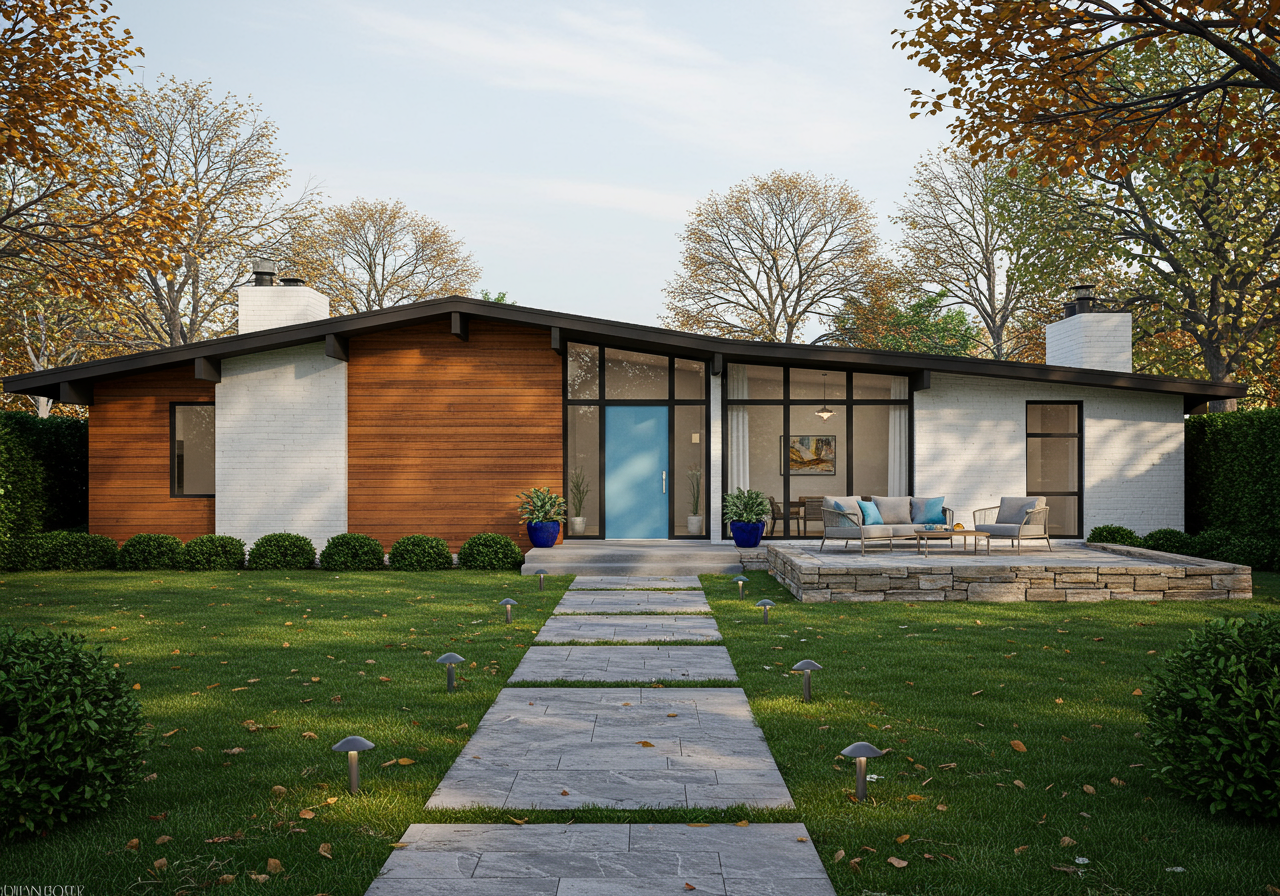
Ultimately, the couple renovated the entire house while staying true to its Mad Men vibe and without changing its footprint. By altering the roofline, the team from Anthony Wilder spruced up the home’s curb appeal. What’s more, the new roof, with its standing metal seam, added height to the ceilings inside as well as light to the whole structure. “It made all the spaces feel larger and opened up the views,” says architect Sean Mullin.
Raise the Roof: The owners didn’t alter the house’s footprint, though they did change the roofline. Photograph by Stacy Zarin Goldberg.
In the living room, a clever built-in bookcase looks original, but it’s a new feature that doubles as a divider separating that space from the den. The master bath, formerly so cramped “you couldn’t turn around in the shower,” says Amanda, was expanded and amped up with a custom cherry vanity that resembles a midcentury bureau.
A house Divided: Though it looks genuinely midcentury-modern, the room divider with built-in shelving is actually new. Photograph by Stacy Zarin Goldberg.
The clean lines of the kitchen similarly pay homage to the house’s period. Its eat-in nook is accented by a Louis Poulsen PH Snowball pendant, a 1958 design that resembles a sci-fi starship. Anthony Wilder interior designer Shannon Kadwell warmed up the whole kitchen with wood accent walls: “I played off the simplicity of midcentury modern,” she says. “Now it connects seamlessly to the outdoors.”
This article appears in the September 2019 issue of Washingtonian.
